Point and Figure Charts

A point and figure chart is:

“A chart that plots day-to-day price movements without taking into consideration the passage of time. Point and figure charts are composed of a number of columns that either consist of a series of stacked Xs or Os. A column of Xs is used to illustrate a rising price, while Os represent a falling price. This type of chart is used to filter out non-significant price movements, and enables the trader to easily determine critical support and resistance levels. Traders will place orders when the price moves beyond identified support/resistance levels.”

Investopedia

“Additional points are added to the chart once the price changes by more than a predefined amount (known as the box size). For example, if the box size is set to equal one and the price of the asset is $15, then another X would be added to the stack of Xs once the price surpasses $16. Each column consists of only one letter (either X or O) – never both. New columns are placed to the right of the previous column and are only added once the price changes direction by more than a predefined reversal amount.”

Investopedia

102906_nasdaq_ttb.png

I use point and figure analysis every night while scanning my charts because I can easily determine key support and resistance levels. Many indicators can trigger buy and sell signals but I stick to the basics and only trade a few patterns that the point and figure charts offer, such as the ones described below (see chart examples as well).

Understand that I use point and figure charts as a secondary technical analysis tool behind candlestick charts (both daily and weekly). I view point and figure charts (will be referred to as a P&F from this point forward) after I find an interesting stock that has already passed my fundamental criteria and peeked my interest on the candlestick charts. Support and resistance levels can be found using basic candlestick and bar charts but P&F charts eliminate the unimportant noise by setting-up the critical levels and breakouts or breakdowns with the more important (larger) moves.

My favorite pattern setup is the Triple Top Breakout which occurs when a stock hits a certain level of resistance on three separate occasions, telling me that a move above this zone has some meaning. Not every triple top breakout will be successful but the odds of a breakout above this setup increase dramatically. As with all trading, you must take the signal with proper position sizing and set your stops without thinking like a human.
[Read more…]

Follow the Leaders

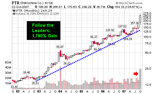
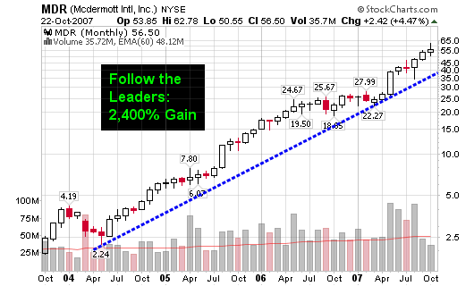
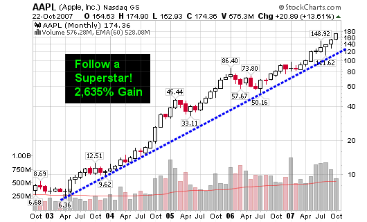
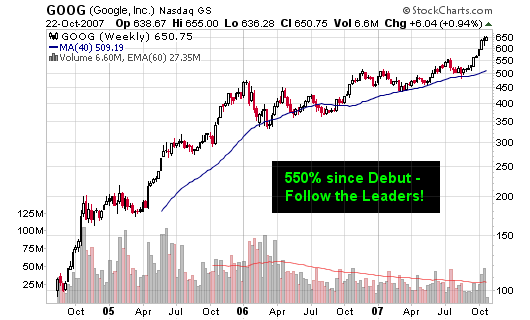
Watch the action among these leaders to truly gauge where the market is headed. Step back and view their long term charts so you don’t get caught up in the day to day MINOR movements!

Seriously, step back and throw the charts on the floor or hang them on a wall across the room and you will clearly see the trends. These stocks have been leading the market higher and will give the FIRST clues of a market looking to go lower! We did have our second major distribution day last Friday and fourth overall but these stocks will tell the ultimate story!

The major Superstars include AAPL, GOOG, PTR & MDR
The minor or more recent Superstars include BIDU, FSLR, GRMN, EDU and others on the blog. See my stocks category to find the leaders of 2007.

102307_aapl_wkly.png

102307_goog_wkly.png

102307_ptr_monthly.png

102307_mdr_monthly.png

[Read more…]

How to Make Money Selling Short

The title of the post is borrowed from the book “How to make Money Selling Stocks Short” by William J. O’Neil. It’s an ideal book for investors that focus on trading longer term trends and don’t necessarily do this for a profession (i.e.: day traders).

The book contains some excellent strategies for finding prime shorting candidates or stocks that are about to enter a declining stage that may offer excellent risk/reward setups for buying put options.

(CLICK FOR LARGER IMAGES)
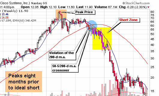
101507_csco_short_sm.png

I consider several of the techniques in the book to be a reverse of the popular trading system? Study the charts from the past that have setup ideal shorts and then screen for those same characteristics in stocks trading today. Many of the ideal shorts from past market declines have held the reverse characteristics of an ideal “popular system” stock (that you would want to buy).

Many traders believe that the most obvious area to place a short would be near the peak of stock’s trading range but studies have found this to be untrue.

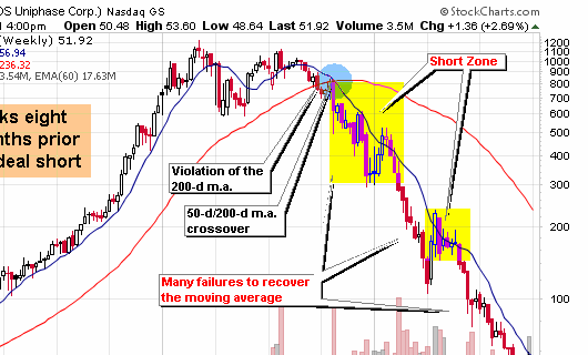
101507_jdsu_short_sm.png

Characteristics of Longer Term Trend Shorts

  • Most ideal longer term “trend” shorts take four to twelve months after the peak price to setup on the weekly chart with the majority of these shorts triggering between six to nine months.
  • Look for stocks that had prior up-trends and support levels that can now act as downward resistance or entry areas.
  • Once a stock tops and starts to consolidate, you want it to slice through the 50-d moving average and then the 200-d moving average.
  • A crossover between the 50-d m.a. and the 200-d m.a. is ideal and is graphically presented on each chart in this post
  • The odds of success increase with each failed attempt for the stock price to recover these major long term moving averages.
  • Head and shoulder tops can also serve as ideal setups for potential shorts if they take at least five months to develop.
  • A decreasing relative strength line and a negative pattern on the point and figure chart can also confirm that the stock is rolling over and setting up an ideal short.
  • Finally, volume should be increasing and the stock should be under distribution as it violates the major moving averages and starts to break former support levels.

[Read more…]

Disregard Conventional P-E Ratio Theory

Don’t base your portfolio buys on P-E Ratio alone; you will most likely miss the biggest winners of each cycle!

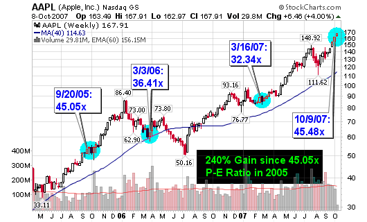
I use the Price Earnings (P-E or P/E) Ratio as a secondary indicator for buying and selling stocks but I don’t use the ratio in the same a manner as many value investors teach. I will explain the difference in my methodology for using the P/E ratio to your advantage.

100907_aapl_peratio.png

Many value investors will pass on a growth stock that has a P-E ratio higher than a predetermined level. For example, they may discard all stocks that have a ratio of 20 or higher, regardless of the industry group they come from. Some investors will discard any stocks that have P-E ratios above the industry group averages, concluding that they are grossly overvalued. I am not saying that this method doesn’t work, because it does but it will not work when you focus on buying young innovative small cap stocks that are growing at tremendous rates, rates that “big caps” can no longer sustain. Growth stocks cost more because they GROW!

[Read more…]

Is Shanghai a Nasdaq Déjà vu

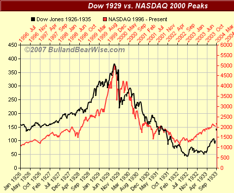
The rise of NASDAQ in the late 1990’s has been compared to the rise of the Dow of the late 1920’s. Chart overlays are amazingly similar.

100207_dow_nas.png
Image from BullandBearWise.com

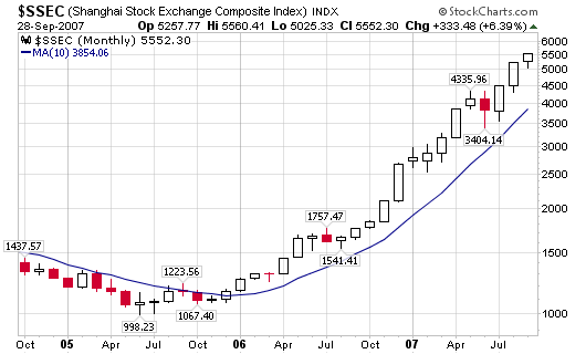
Well, the current two year rise of the Shanghai Stock Exchange Composite Index looks remarkably similar to the rise of the NASDAQ of the late 1990’s and the charts below explain better than I can!

100207_nas_up.png

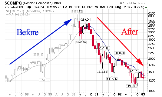
The NASDAQ rose from 1,250 to 5,132 from March 1997 to March 2000: 310% gain!
The Shanghai Stock Exchange has moved from 998.23 in June 2005 to 5,552.30 today (10/2/07): 456% gain!

100207_shanghai.png

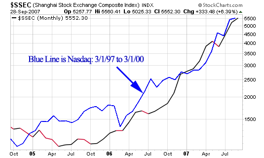
As you can see, the blue line of the late 1990’s NASDAQ has moved meticulously with the Shanghai Index of today.

100207_nas_shang.png

Will the Shanghai Stock Exchange end up with the same result as the NASDAQ of the late 1990’s. As you can see, the NASDAQ went from 1,250 to 5,132 back down to 1,192 (all within a five year period).

100207_nas_rise_fall.png

This won’t happen overnight but human nature always repeats so expect a huge decline in the Shanghai Stock Exchange within the next several years.

1929, 1999, 2007, etc…

“Wall Street never changes, the pockets change, the stocks change, but Wall Street never changes, because human nature never changes” – Jesse Livermore.

“The price pattern reminds you that every movement of importance is but a repetition of similar price movements, that just as soon as you familiarize yourself with the actions of the past, you will be able to anticipate and act correctly and profitably upon forthcoming movements” – Jesse Livermore

“All through time, people have basically acted and re-acted the same way in the market as a result of: greed, fear, ignorance, and hope – that is why the numerical formations and patterns recur on a constant basis” – Jesse Livermore