Health Care and Pharmaceutical Bottom?

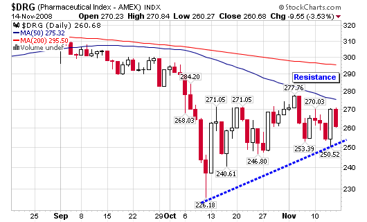
Health Care and Pharmaceutical stocks look to be making a bottom (maybe only a short term bottom) with higher lows and higher highs. I am not ready to jump on board and throw a party because the Health Care and Pharmaceutical tracking indexes and Healthcare iShares listed below are still trading below both their 50-d and 200-d moving averages. Long term they don’t look so hot but short term traders may think differently, profits can be had if you are willing to take a risk in this market. Unlike the Airline Indexes profiled last week, these indexes are lacking a 10/30-week moving average crossover which also tells me it’s early to jump on board.

In any event, the short term daily charts display churning in what seems to resemble a bottom even though the longer term weekly charts leave a lot less to be desired. As with the airlines indexes, the overall market health is still very weak so don’t buy blindly but keep health care and pharmaceutical stocks on your watch list for now. All bottoms must start somewhere and these indexes look to be turning higher or at least establishing a flat trading zone before picking the next direction.

($RXP) Health Care, $1200.25
($DRG) Pharmaceutical Index – AMEX, $260.68
(IYH) Healthcare iShares, $51.59

Several of the stocks listed below are components or holdings of one or more of the indexes and iShares listed above.
[Read more…]

New Highs, New Lows and Industry Strength

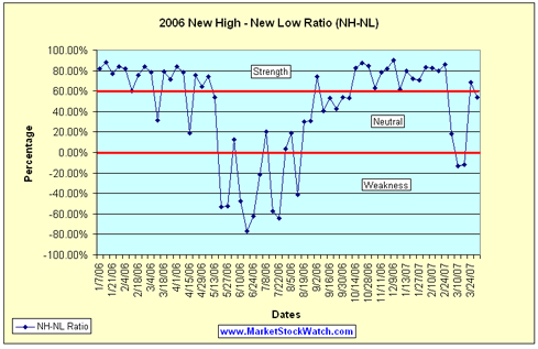
The New High-New Low Ratio (NH-NL) crossed into neutral territory for the first time since early October 2006. It then briefly stopped in negative territory for the weeks ending March 10 and March 17, the first time this happened since August 2006. The ratio has been volatile with direct relation to the large up and down swings of the market so don’t read too much into that action. I am watching to see if the ratio can hold steady and maintain some strength near the 60% level without dropping back to negative territory. The streak of higher highs and higher lows is now over and the consolidation phase from October to February has been snapped to the downside. The first red flag has been signaled with the violation of the support level so now look for additional red flags such as any trend that develops making lower highs and lower lows on a consistent basis.

040207_nh_nl_ratio_sm.png

Keep in mind, it was March and April 2006 that started the steak of weakness last year in this ratio and the market as a whole.

Weekly New High – New Low Ratio (NH-NL) for 2007:
Saturday, January 6, 2007: 279-67
Saturday, January 13, 2007: 344-39
Saturday, January 13, 2007: 281-46
Saturday, January 27, 2007: 316-55
Saturday, February 3, 2007: 502-45
Saturday, February 10, 2007: 558-53
Saturday, February 17, 2007: 428-48
Saturday, February 24, 2007: 556-42 – This past week (a short week)
Saturday, March 3, 2007: 187-130
Saturday, March 10, 2007: 96-125
Saturday, March 17, 2007: 114-145
Saturday, March 24, 2007: 284-53
Saturday, March 31, 2007: 227-68

Below is the latest action among the industry groups I follow to gauge market strength from one area to another:

[Read more…]

Industry Analysis Using Investor’s Business Daily

Using industry analysis can play a very important role when looking for quality stocks to place into your portfolio or looking for laggards to sell. As we know, sister stocks travel in groups and 50% to 75% of a stock’s move can be attributed to the industry group itself. Therefore, it is a smart idea to study which groups are the strongest and which groups are falling out of favor.

Looking below, we can see that several Oil & Gas related industry groups are topping the charts along with metal related groups over the past week. They are the groups making the strongest advances over the past five trading days according to the data from IBD. I do gather the majority of my data from the electronic version of Investor’s Business Daily and have been a member since 2001.

When viewing the strongest one week and year-to-date moves, we can see that growth stocks are not leading the market as industrial related industries are making the best gains. Oil, metals, machinery, energy and trucks are populating my screens which tell me that the market is in defensive mode, not offensive and that is why much of my account is in cash (among other reasons).

Top 10 One Week Industry Moves:
Diversified Operations
Metal Ores – Gold/Silver
Oil & Gas – Field Servic
Oil & Gas – US Expl Pro
Utility – Electric Power
Metal Prds – Fasteners
Comml Svcs – Printing
Tobacco
Food – Misc Preparation
Oil & Gas – Drilling

Top 10 Year-to-Date (YTD) Industry Moves:
Oil & Gas – Machinery
Energy – Other
Auto/Truck – Original Eqp
Machinery – Farm
Oil & Gas – US Integrat
Machinery – Constr/Mining
Trucks & Parts – Hvy D
Comml Svcs – Schools
Machinery – Tools & Re
Elec – Parts Distributors

It is also important to follow the weaker industries so you can determine the overall market trends and trade according to the stocks in favor. Several hi-tech growth industries have fallen to the bottom of the pile over the past week and for the year. Multiple computer and internet related industries are leading the market to weakness as retail and finance are not far behind. Of course I can’t forget to mention that the residential building industry has lost its recent steam but seems to be gaining some support near multi-year lows. This could be a buying opportunity area for longer term value investors if support holds.

Bottom 10 One Week Industry Moves:
Bldg – Resident/Comml
Soap & Clng Preparat
Retail – Consumer Elec
Internet – Content
Retail/Whlsle – Jewelry
Retail – Leisure Products
Finance – Investment Bkrs
Telecom – Equipment
Leisure – Hotels & Mot
Bldg – A/C & Heating

Bottom 10 Year-to-Date (YTD) Industry Moves:
Computer – Peripheral Eqp
Computer Sftwr – Desktop
Finance – Investment Mgmt
Retail/Whlsle – Cmptr/Cell
Bldg – Resident/Comml
Finance – Investment Bkrs
Retail – Consumer Elec
Retail – Leisure Products
Medical – Ethical Drugs
Computer-Manufacturers

YTD Performances

In the charts below, I have grouped together the performance in 2006 of the three main indexes, major world currencies, commodities, specific industries and some sector spdrs in the charts below. I have always found it interesting and sometimes useful to watch the performance of major market indexes, sectors and industries. Charts like these can serve as macro views of the general market but don’t ever use these types of charts to pinpoint potential market tops and bottoms. I use them to help confirm action among the individual stocks that I am looking to buy or sell. Secondary indicators is all they are in my opinion.

Major Indexes:
$INDU – Dow Jones Indu., 13.16%
$SPX – S&P 500, 10.33%
$COMPQ – NASDAQ, 6.35%

Commodities:
$GYX – GSCI Industrial Metals, 57.87%
$GPX – GSCI Precious Metals, 14.35%
$GOLD – Gold, 12.74%
$WTIC – Crude Oil, -3.65%
$GJX – GSCI Energy, -8.06%

Currencies
$XBP – British Pound, 8.97%
$XEU – Euro, 6.09%
$XSF – Swiss Franc, 3.88%
$XJY – Japaneese Yen, -1.82%
$USD – US Dollar, -4.85%

US Industries
$XOI – Oil, 14.96%
$DRG – Drugs, 12.73%
$RLX – Retailers, 9.45%
$HCX – Health Care, 6.69%
$TRANQ – Transport, 6.42%
$SOX – Semiconductors, -7.31%

Select Sector SPDRs
XLU – Utilities, 16.25%
XLF – Financial, 13.39%
XLB – Materials, 11.77%
XLI – Industrial, 10.97%
XLK – Technology, 9.12%
XLV – Health Care, 7.66%

Piranha

Big Caps still moving after 3 Months

Howard Lindzon made a blog post yesterday titled “New Highs are THICK and BIG BIG BIG CAPS in nature”

He goes on to write that companies such as American Express, Banc of America, McDonalds, Harley Davidson, International Game Technology, American Eagle, Autozone, Allstate, Nike, & Verizon are all looking good on the charts (possible breakout heaven).

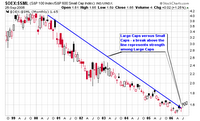
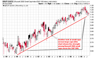
I agree and have been writing about large caps making a move since July with my first major post highlighting McDonalds and the chart of the S&P 100 Index/S&P 600 Small Cap Index. TraderMike brought this chart to my attention earlier in the summer from his own blog post.

Here are the links to my original posts highlighting the gaining strength among BIG CAP stocks:

July 18, 2006
Large Caps Gaining Strength
“The chart associated with this post is telling us that Large Caps are gaining strength versus Small Caps. Time will tell but yesterday could have been the first round of confirmation.”

July 17, 2006
MSW Market Overview
” tend to rely on the NASDAQ more so than the DOW but it is interesting to see that large caps are gaining some steam while small caps are getting trounced.”

July 21, 2006
Ten Stocks to Watch
“The S&P 100 Index/S&P 600 Small Cap Index that I track is up over 6% this week for its largest gain in years, confirming that large caps are moving to the head of the class.”

Piranha