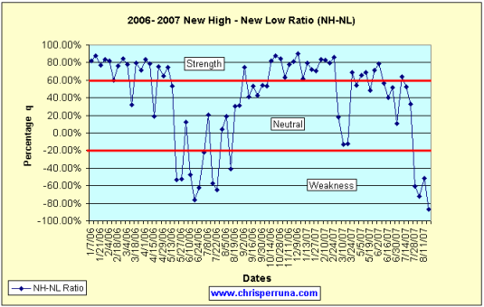
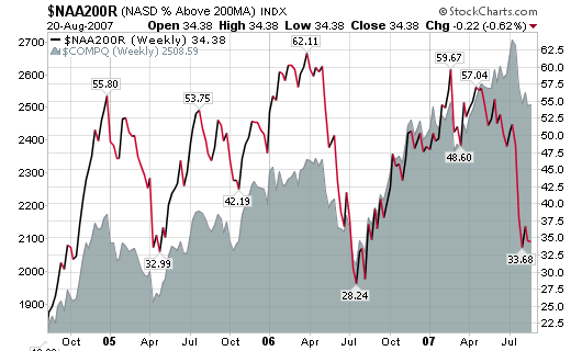
New High New Low Snapshot

Does the New High, New Low Ratio still work?

Of course it does but just keep in mind that it’s a longer term indicator rather than a short term buy and sell signal. I make today’s post due to what I am seeing with the NH-NL differential as it is starting to tread near positive territory for the first time in many months. The key for a sustainable bull market will be a push to a new 52-week high for this indicator.

010509_nhnl_wkly

“Chart provided courtesy of “DecisionPoint.com

For a history of NH-NL posts, please see this category.

How about the foreshadowing provided in the post I made on August 21, 2007? Talk about calling a top!

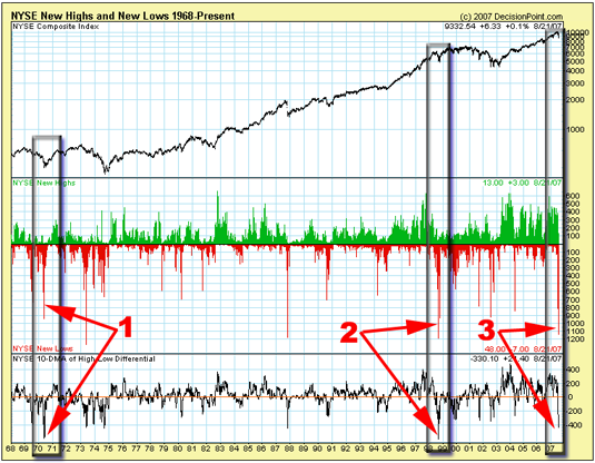
According to Carl’s data, we must go back to 1998 to find a lower reading than last week’s NH-NL ratio. Even more amazing is the fact that we must then go back 20 to 38 years to find readings in the same vicinity as 1998 and 2007.

Ignoring the spike in 1987, we must visit the 1970’s to find readings below the -400 level on the chart.

010609_indu_wkly

Extreme New High – New Low Readings

The New Year started by giving the market the third lowest NH-NL Ratio rating since the start of 2007 with an adjusted average of -83%. Only the weeks ending on Saturday, November 24, 2007 (-84%) and Saturday, August 18, 2007 (-87% – the lowest in more than 5 years) were weaker. In contrast, 2006 ended on a positive note and extended its run with a decent opening in 2007; the prior New Year (05-06) did much of the same. (Complete NH-NL Data is at the bottom of this post)

We have not had a bullish reading (as noted in the legend on the chart – click for full view) since the week ending on Saturday, June 2, 2007. Last year (2007) ended with only half as many “very bullish” weeks as we witnessed in 2006.

*click the image for a larger view*

010908_nh_nl_sm.png

New lows topped 3,000 for the first time in many years during the week ending Saturday, November 10, 2007. This is the first reading of this type that I can find dating back to the 2002 data that I have stored on my computer.

The market gave us exactly 1,000 new lows last Friday, only the third time we reached or topped this number over the past couple of years.

So, what does all this confusing NH-NL Ratio data mean?

Well, the data of the past has actually guided us in and out of the market while it was trending but I have also noticed how the extremes have come precisely when the market is looking to reverse and move in the opposite direction. We have been getting many extremes over the past few weeks and months (including last Friday).

Are the current extreme levels telling us that this market has a bounce coming?

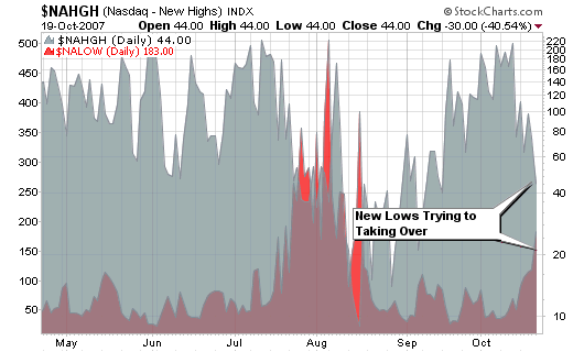
According to the charts, it does. We should see some type of a bounce considering that the NASDAQ reversed nicely to close the day Wednesday and the fact that other indicators are pointing for a reversal as well. The NASDAQ is at the lower end of its Bollinger Bands as shown on a chart below (the green band).

010908_nas_bb.png

The market bottomed the last time I made a significant post about the NH-NL Ratio on August, 21, 2007 is a thread titled: New High New Low Ratio Sets New Low

Historical chart (1968-2007) here for the Lowest Hi-Low Differential in Nine Years

[Read more…]

Second Major Distribution Day

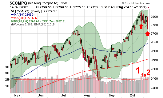
We witnessed our second major distribution day as the DOW was down 2.6% on volume 40% larger than the prior trading day. The NASDAQ was down 2.6% on volume 15% larger than Thursday.

It was the worst selloff for the NASDAQ since February and the largest for the DOW since August. Volume surged across all major indexes but do keep in mind that it was options expiration day.

102007_snp_50d.png

Technically speaking, we now have 4 distribution days for the NASDAQ and 3 for the DOW over the past month. It’s now time to start focusing big-time on the market leaders to see where they are going to take this market. If they start to roll over, you better be quick to take profits and even quicker to take losses.

Here’s what I had to say last Thursday, October 11, 2007 (see the charts in this link as well: Distribution Day)

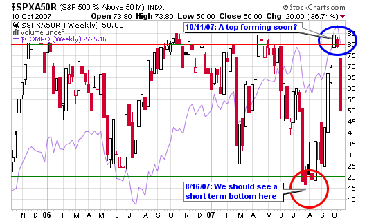
The number of stocks above their 50-day moving averages crossed above the overbought level of 80 last week and we saw our first major sell-off distribution day yesterday. This doesn’t mean you must rush today to sell all of your holdings but do understand that the next sell-off is not far from happening. Study the chart below and follow the purple line to see where and when the market had peaks and valleys as related to the number of stocks on the S&P 500 above or below their respective 50-day moving averages.

The markets flashed a heavy distribution day Thursday as the NASDAQ was down 1.4% on volume 60% larger than the previous day. This was the largest showing of volume in two months and is not healthy because it was pure distribution. It was only the second distribution day over the past month so we can’t call this a bear run but please be on the lookout for a possible correction of 5%-10%. Technology stocks led the decline as BIDU gave back 10% of its amazing run.

102007_nas_daily.png

102007_nh_nl.png

Lowest Hi Low Differential in Nine Years

Tonight’s chart comes to us from Carl Swenlin, the President at Decision Point

I want to thank Carl for allowing me to upload the chart that shows the 10-day moving average of the Hi Lo Differential. Another thanks to Mike for leaving me the comment to contact Carl.

*click the image for a larger view*
*Note: I added the “1,2,3” graphics from photoshop*

082107_nhnl_dp_sm.png

According to Carl’s data, we must go back to 1998 to find a lower reading than last week’s NH-NL ratio. Even more amazing is the fact that we must then go back 20 to 38 years to find readings in the same vicinity as 1998 and 2007.

Ignoring the spike in 1987, we must visit the 1970’s to find readings below the -400 level on the chart.

*click the image for a larger view*
*Note: Original Chart*

082107_nhnl_dp_orig_sm.png

And don’t forget to stop by Carl’s site, Decisionpoint.com

New High – New Low Ratio Sets New Low

The markets gave us 2,952 new lows last week, surpassing the previous multi-year weekly low of 2,862 set in the final week of July 2007. The NH-NL ratio dropped to its worst level in more than five years with a weekly reading of minus 86.89%.

Last week averaged 41 new highs per day and 590 new lows per day with the ultimate apex coming on Thursday with a daily reading of 33-1,276. I can’t even find a reading of minus 94.96% in my data which stretches back to the post bubble days. Thursday is now the weakest reading my data has ever recorded (keep in mind that I started to store this data in excel back in 2001 so I am sure it is not the worst ever or even the worst reading over the past 10 or 20 years).

See a Historical chart (1968-2007) here for the Lowest Hi-Low Differential in Nine Years

*click the image for a larger view*

082107_nh_nl_ratio_sm.png

The past four weeks have compiled new lows of 2,862, 2,646, 2,095, and 2,952 for a monthly average of 2,639; comparatively, May had an average of 450 or one sixth the number of stocks making new lows over the past month.

We recorded our first reading of more than 1,000 new lows on Monday August 6, 2007 after writing this very popular post:
A Negative New High – New Low Ratio (NH-NL)

The NH-NL Ratio remained in negative territory for nine of thirteen weeks in the spring and summer of 2006 while the NASDAQ corrected from 2,300 to 2,000. If that is any indication of what the market wants to do now, be prepared to watch the market tread sideways to slightly lower over the next few months. Yes, the Fed is screwing with the natural progression of the market by bailing out Wall Street’s mistakes but all things reach their equilibrium sooner or later.

082107_nas_200d.png

So what does this all mean?
As I said in my last NH-NL Ratio post:

It means that the market should be ready to correct by “another” 10% based on the history of my NH-NL studies.

In addition to watching the NH-NL Ratio, I keep an ongoing database with the movements of the 197 industry groups tracked by Investor’s Business Daily. Unfortunately, I can’t reproduce that proprietary information here as they will be sending me e-mails warning me to take it down as it is for subscribers only (it has happened before). However, I can list the general industries that are gaining and losing steam over the past couple of weeks as this information can be compiled anywhere on the web.

The industries on the move happen to be retailers with emphasis on:

  • Consumer Electronics
  • Drug Stores
  • Super Markets
  • Wholesale Food

Aside from Retailers, Banks are also on the rise since the Fed made their move.

[Read more…]