Identify Market Tops and Bottoms by Doing this, Guaranteed!

Can major market tops and bottoms be identified with accuracy? Yes, they can! And I will present data that will argue that identifying “major” market bottoms is easier than any other change in market direction. Market tops can also be identified but it’s a bit more difficult than bottoms.

No one can guarantee an “exact top or bottom” but this data will pinpoint an overall change in trend. There’s plenty of time to get out of the market before a devastating fall and even more time to jump on a new up-trend after a bottom.

To support my findings, I will use extensive New High and New Low (NH-NL) data extracted from the NYSE in 2008 and 2009. This data phenomenon is not exclusive to the market bottom of 2009 as studies will show the exact, yes exact, same results can be extracted from every other major market bottom stretching back as far as the NH-NL data is available.

New High – New Low data is historically the most accurate indicator for identifying a major change in trend by highlighting extreme readings and the change in underlying market breadth.

The images contained in this article will identify the following data points:

  1. NYSE New Highs: The number of stocks making New Highs on a specific date
  2. NYSE New Lows: The number of stocks making New Lows on a specific date
  3. New High –New Low Differential: This is simply the number of stocks making new highs minus the number of stocks making new lows.
  4. NH-NL 10d Diff: This is a simple 10-day moving average representing the number of stocks making new highs minus the number of stocks making new lows.
  5. NH-NL 30d Diff: This is a simple 30-day moving average representing the number of stocks making new highs minus the number of stocks making new lows.
  6. NH-NL % Ratio: To calculate the percentage correctly, use this formula: (New Highs – New Lows) / (New Highs + New Lows) * 100 = X%
  7. NH-NL % Ratio 10d Ave: This is a simple 10-day moving average representing the percentages listed in the column terms #6 in this list

I follow the progress of stocks making new highs and new lows on the NASDAQ and NYSE and pay specific attention to turning points in the differentials and ratios. I am particularly interested in the extreme highs and lows of the readings, especially after a long trend, as they start to drop hints of an impending change of trend (positive to negative and negative to positive).

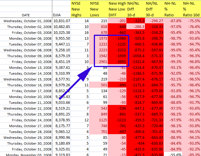
The image below shows that New Lows had dominated the market for nearly 18 months when extreme readings started to appear in October 2008. In fact, the readings in October 2008 were the most extreme that my NYSE NH-NL data contains which goes back to the early 1980’s.

010509_NHNL_wkly_18months

October 2008 NH-NL Readings for NYSE:
2008_10 - October

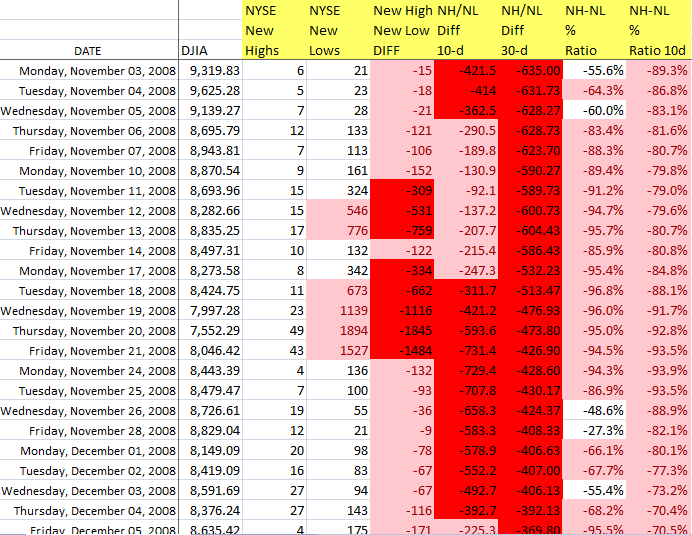
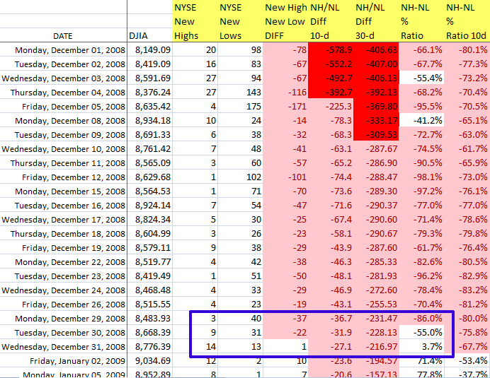
As the second image shows, the daily New Low readings were well above 1,000 with a peak of 2,901 on Friday, October 10, 2008. The market was screaming exhaustion as the selling pressure of the past 18 months was hitting its max. All other readings were in extreme territory including the basic NH-NL differential, the 10d & 30d differentials and the % ratio. The extreme readings continued through the end of November 2008 when they final subsided in December but remained negative.

November 2008 NH-NL Readings for NYSE:
2008_11 - November

December 2008 NH-NL Readings for NYSE:
2008_12 - December

Heading into early 2009, “blood was running in the streets” as Baron Rothschild once declared and most investors had been knocked to their knees while two of the most prestigious investment banking firms in America disappeared. The greatest value investors of all time state that the best time to buy is when this type of extreme environment occurs. The problem with that statement is that it’s based purely on fundamentals and I just can’t blindly jump-in and grab shares without some form of technical guidance. Think about that for a second, blood had been running in the street for the duration of 2008 so I suspect that many value investors were buying and saw more pain before the market decided to turn. Buyers in early to mid 2008 had to endure quite a ride before the market turned up in the spring of 2009. I prefer to catch a trend on the up-swing, not the bottom; besides, pinpointing the exact bottom is virtually impossible.

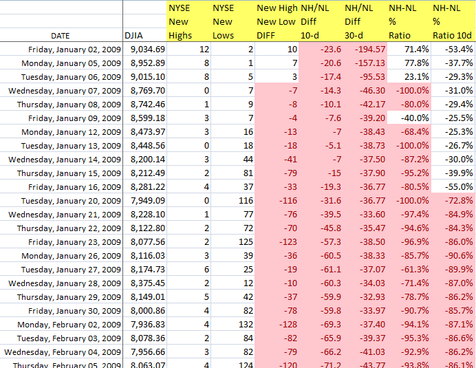
January 2009 NH-NL Readings for NYSE:
2009_01 - January

Bernard Baruch was quoted as saying: “Don’t try to buy at the bottom and sell at the top. This can’t be done–except by liars.”

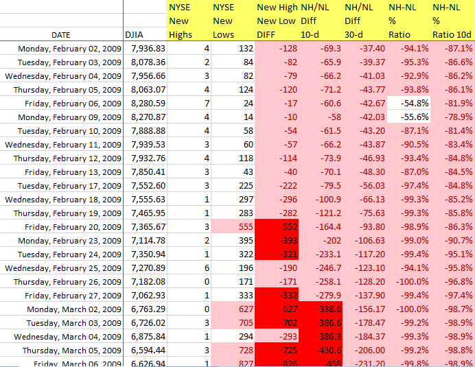
January 2009 was much like December 2008 as the market remained negative. Then in February 2009, the market dropped again as the NH-NL readings started to head back towards more extreme levels. However, they didn’t reach the levels of October 2008 so this signified a “higher low” for the readings, a second clue that the market may be looking to reverse direction.

February 2009 NH-NL Readings for NYSE:
2009_02 - February

NH-NL Readings making higher lows for NYSE:
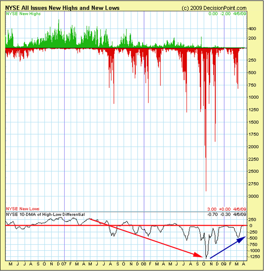
040609_NH_NL_trend change

March 2009 was the turning point. The extreme readings subsided (light red and dark red readings on my graphics) and the FIRST positive reading was registered since May 2008 (represented by “blue figures” on my graphics). On March 26, 2008, the NYSE logged a reading of 10 New Highs and 0 New lows, the first time a “0” New Low reading was logged since February 27, 2004. By contrast, the NYSE logged 11 additional days with “0” New Lows in 2009 and 20 days with “1” New Low for that same year. The year 2008 had one day with “1” New Low and the years 2005, 2006 and 2007 had zero days with “1” New Low. Amazing stats!

[Read more…]

2013 Stock Market Outlook: Buying in a Low Risk Environment

President Barack Obama has been reelected as the President of The United States of America and many investors remain concerned that they don’t know what to expect in the years ahead. None of us have a crystal ball but we can always fall back on reliable charts, indicators and historical analysis to help give us an edge.

Historically speaking, November, December and January are the year’s best three-month span in terms of overall percentage performance for the S&P 500 (data from 1950 through today). Similarly, the NASDAQ is historically best from November through January with an extended positive trend running through to June (data from 1971 through today). The Stock Trader’s Almanac states that the year-end strength comes from corporate and private pension funds.

There are a couple of things to consider before backing up the truck and investing in stocks.
1. Understanding the general economic environment & fiscal policy
2. Understanding technical analysis of the markets to anticipate low risk environments

It is very important to understand that fiscal policy, the taxing and spending power of the Federal Government, may be the most powerful influence affecting the nation’s and many times the world’s economies. Now, Bernanke and The Federal Reserve do not have the power and mechanisms to control movements in money with accuracy over the short term but they often tip their hand and lend a clue for long term performance.

In addition to The Fed, unique cycles occur within markets, such as the 4-year presidential cycle and we know by studying the markets that recessions typically occur in years between presidential elections. With the 2012 election behind us, we will now be headed into that territory; however, we also saw what took place during President Bill Clinton’s second term (boom). So use history as a gauge with relation to what’s happening today and not a full-fledged prediction tool. Macro cycles clearly exist so I suggest you become familiar with their tipping points and seek action when opportunity becomes favorable (I will highlight some techniques below).

Although the Federal Reserve has enacted a policy of near free credit, the private business sector in the United States is deleveraging. It has been argued that the business sector has been accumulating large surpluses of cash reserves since the meltdown of 2008-09. One can argue that this deleveraging is responsible for the poor economic activity over the past several years. American businesses and individuals to some extent are more concerned about repaying their debts than discretionary spending. This is the main reason why The Fed’s generous monetary policies have been mostly ineffective.

Some analysts have suggested that the deleveraging (debt reduction) may continue for another 4-5 years which would extend the length of Obama’s entire second term. If that is the case, interest rates should remain low and prove that additional stimulus will provide little to no spark to an already sluggish economy. I don’t know how unemployment will turn out but it benefits us all if these figures improve so consumer spending can edge higher thus creating further job opportunities.

Will we face a period of hyperinflation or complete deflation? I don’t know and I can’t lead my life based on “possible doomsday scenarios”.

One may believe that I am tilting to the bearish side on the macro perspective of the market but that is not the case because there are two sides to investing: Fundamentals and Technicals. Up-trends and down-trends will form in the market regardless of marco bear and bull cycles. So, I will keep investing in strong American companies via the stock market regardless of any pending “fiscal cliffs”. As far as the fiscal cliff is concerned, I’d like to believe that Washington will figure something out, at least in the near term (next several years). It behooves us all.

Moving on, investors should know approximately when to expect opportunities to buy stocks at relatively low risk by using technical analysis to recognize these opportunities. The fundamentals usually point us towards “what” while the technicals usually tell us “when”. In buying young, innovative and profitable American companies, I am looking at holding their shares from anywhere between 6 and 36 months. Ideally, the average position will last from 6-18 months as I am not in the business of trading or flipping for a quick profit. I have a full time career so short term focus on the market is kept to a minimum these days.

As highlighted in the past (on this blog), we must look towards a few simple charts that will give all investors a fantastic risk vs. reward setup/ signal. By following these simple charts, any investor should be able to consistently outperform the market (buy when the market is deeply depressed and sell when it becomes over-bought). Please keep in mind that these signals are for longer term investors as they only appear once every year or so.

The three charts represent the following:

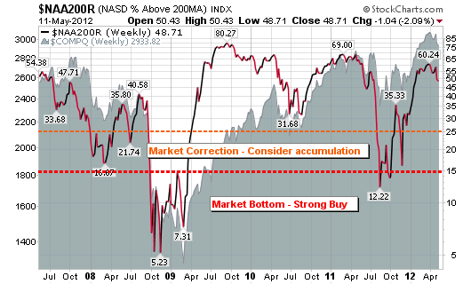
1. The % of stocks above the 200-day moving average for the NASDAQ
2. The % of stocks above the 50-day moving average for the S&P 500.
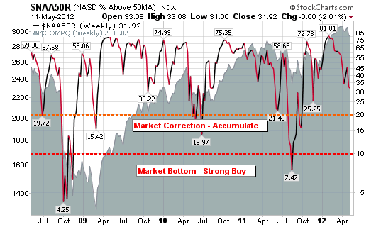
3. The % of stocks above the 50-day moving average for the NASDAQ

I consider this first chart the most powerful of the three (because of the sheer magnitude of the weakness or strength charted among individual securities) for gauging the overall risk level for accumulating shares in the market. The chart highlights the NASDAQ percent of stocks above the 200-day moving average. It is a rare occurrence when only 5%-15% of all stocks are trading above their 200-day moving average on one or more of the majors indices. Think about that for a moment, the idea of having 85%+ of all stocks trading below their respective 200-day moving average. This level of depression shows that the market is likely close to a bottom and is providing a nice risk-to-reward accumulating opportunity.

The levels reached in late 2008 and 2009 were near historical lows and provided one of the best opportunities to accumulate shares in recent memory. In fact, the percentage of stocks trading above their respective 200-day moving averages (on the NASDAQ) in late 2002-2003 only fell as low as 12.29%. As you can see on this chart, the levels reached in 2008 and 2009 went as low as 5.23%. In other words, nearly 95% of all NASDAQ stocks were below their 200-day moving averages. If that doesn’t scream buy, I don’t know what does.

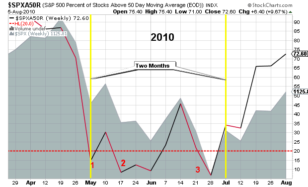
By using the second chart, we are looking for the S&P 500 percent of stocks above the 50-day moving average to cross below the “20%” oversold level. Historically, this is a level that signals a lower risk environment to commence accumulating shares in leading stocks. Please note that oversold levels for the general market can last for a period of several months so please be patient with your buys. Investors do not have to buy as soon as this level is breached and the summer of 2011 serves as a nice example.

Similar to the second chart, the NASDAQ percent of stocks above the 50-day moving average also triggers a nice risk-to-reward environment for accumulating shares. The investor would be wise to start accumulating shares when the percentage of stocks drops below the “10%” oversold level. Late 2008 through early 2009 and the summer of 2011 serve as the most recent examples.

With the above in mind, continue to monitor these charts and have the courage to buy when “blood is running in the street”. Investors must have the courage and intelligence to buy when markets are beaten down and individual securities are collectively trading near lows. A completely separate post would be required to discuss “which stocks” to buy at these depressed levels but a quick rule of thumb is to focus on the market leaders, ones showing strong relative strength and earnings growth.

Looking at the current readings on all three of these charts, I can confidently venture to say that we are not in the prime low risk accumulation phase of the market. We appear to be heading in that direction but we are nowhere near a major bottom. Keep an eye on fiscal policy, economic indicators such as unemployment, consumer spending and the three charts above. By doing this, every investor should be prepared to accumulate shares in a favorable, low risk environment.

Corrections Take Time, Be Patient

As I surf the twitter and blog world tonight, I see an unusual number of people claiming a market bottom based on “historical readings” among many of the secondary indicators.

Several of my indicators are also starting to enter those same levels but what many are failing to realize is that the market can take several months to complete a full correction and reach a bottom.

See below for the most recent two year chart with individual corrections for both of the recent bottoms in 2010 and 2011 (highlighted below the 20% figure).

As you can see in 2011, the secondary indicator started to flash “bottom” signals in June but the market didn’t complete its volatile correction until September.

In the summer of 2010, the secondary indicator started to flash “bottom” signals in May but the market didn’t complete its correction until July, two full months of up-and-down action.

The lesson: 2012’s secondary indicators started to FLASH a market bottom last Friday, for the FIRST time. Based on past corrections (going back a decade), this will only be the start of a volatile period of up-and-down action that could last several months (the swings can be greater than 10%). Be Patient!

When to Buy – Low Risk & High Reward

This post contains three simple charts that will give all investors a fantastic risk vs. reward setup/ signal. By following these simple charts, any investor should be able to consistently outperform the market (buy when the market is deeply depressed and sell when it becomes over-bought). Please keep in mind that these signals are for longer term investors as they only appear once every year or so.

The three charts represent the % of stocks above the 50-day moving average for the NASDAQ, the % of stocks above the 200-day moving average for the NASDAQ and the % of stocks above the 50-day moving average for the S&P 500.

The recent sell-off has been steep (points only) but unfortunately, we haven’t come close to historic bottom signals. This simple fact (using the charts below) suggests that the market has further room to consolidate so be careful with your buy and sell decisions.

Market Pullback and Energy Opportunities in COP and BP?

Set stops and look to take some profits at sign of weakness – a couple of signals are popping up for a slight brake right now $$ – 11:25 AM – 9 Feb 12 via web

That was my tweet from Thursday, February 9, 2012.

The signs that I was referring to are located in the following two charts. The divergence over the past month is very clear on the charts below as the transports are showing weakness in comparison to the industrials. I am not calling a market reversal or downtrend but I am seeing some exhaustion among the leaders and major market averages. Recent gains need to be digested before moving higher (if that’s where 2012 is headed).

Oil has become a topic of interest with gasoline prices across America making headline news on a daily basis. With crude oil pushing higher, above $100, I have become interested in two dividend plays that also present solid technical charts.

ConocoPhillips ($COP – $73.36) operates as an integrated energy company worldwide. The company’s Exploration and Production (E&P) segment explores for, produces, transports, and markets crude oil, bitumen, natural gas, liquefied natural gas, and natural gas liquids.

The company has a market cap just shy of $100B, an annual dividend of $2.64/3.60%, 65% held by institutional investors and a P/E of 8.17x. A move to new highs could catapult the stock well into the $80 range (along with that dividend). The company has been experiencing an increase in net income, year over year revenue growth and a solid record of earnings growth. One could argue that the ideal entry is closer to the 50-d moving average.

BP p.l.c. ($BP – $47.62) provides fuel for transportation, energy for heat and light, retail services, and petrochemicals products. Its Exploration and Production segment engages in the oil and natural gas exploration, field development, and production; midstream transportation, and storage and processing; and marketing and trading of natural gas, including liquefied natural gas (LNG), and power and natural gas liquids (NGL).

The company has a market cap of $150B, an annual dividend of $1.92/4.03%, 10.68% held by institutional investors and a P/E of 5.90x. A move to new highs could push the stock back towards pre- “Gulf of Mexico” disaster levels (along with that dividend). The company has been experiencing increasing net income, growing revenues, reasonable debt and future potential with new contracts and repaired brand image.

As with $COP, an ideal entry for $BP is closer to the 50-d moving average but we are targeting these stocks as value plays considering their dividends and low PE’s.