16 Trading Quotes & Books for 2016

“The obvious rarely happens, the unexpected constantly occurs.” – Jesse Livermore

“A speculator is a man who observes the future, and acts before it occurs.” – Bernard Baruch

“What seems too high and risky to the majority generally goes higher and what seems low and cheap generally goes lower.” – William O’Neil

“Successful speculation implies taking risks when the odds are in your favor.” – Victor Sperandeo

“Stocks are bought not in fear but in hope. They are typically sold out of fear.” – Justin Mamis

“Accepting losses is the most important single investment device to insure safety of capital.” – Gerald M. Loeb

“To me, the “tape” is the final arbiter of any investment decision. I have a cardinal rule: Never fight the tape!” – Martin Zweig

“You have to master your ego & realize that being profitable is more important than being right.” – Martin Schwartz

“Losing a position is aggravating, whereas losing your nerve is devastating.” – Ed Seykota

“If you spend more than 13 minutes analyzing economic and market forecasts, you’ve wasted 10 minutes.” – Peter Lynch

“Risk comes from not knowing what you are doing.” – Warren Buffett

“You must learn that the market is a discounting mechanism, and that stocks sell on future and not current fundamentals.” – Stan Weinstein

“I was successful in taking larger profits than losses in proportion to the amounts invested.” – Nicholas Darvas

“The first rule of trading – there are probably many first rules – is don’t get caught in a situation in which you can lose a great deal of money for reasons you don’t understand.” – Bruce Kovner

“Intellectual capital will always trump financial capital.” – Paul Tudor Jones

“I have noticed that everyone who has ever tried to tell me that markets are efficient is poor.” – Larry Hite

Market Tops Take Time to Form

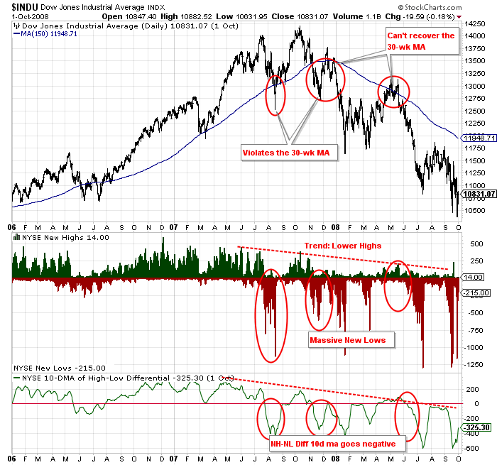
Market tops take time to form as the 2007-2008 graphic shows below. I developed the graphic due to several comments and inquiries following last week’s blog post titled “Calling a Market Top”.

Several stocktwits and twitter readers decided to comment without reading the entire blog post or did not read it at all. They were quick to judge and throw out “bear” connotations based on the title of the post rather than digest the content.

Today’s post further dives into the details and length of time the 2007-2008 market top actually took to form before fully breaking down (upwards of 10 full months). In contrast, the current market is barely a month into the first red flag, therefore, no one should be calling a definite market top – and I don’t believe anyone is, at least not around here.

2014_10-30_NHNL_Diff_NYSE_2007vs2014

The most interesting aspect of the 2007-2008 market top is the fact the market made new highs, after the first red flag. The NH-NL indicator also went back to positive territory after the initial negativity in July and August of 2007 (point #1 in the 2007-2008 side of the graphic).

New Highs averaged 129 per day while new lows averaged 252 per day in August 2007. The indictor turned more positive following the summer as New Highs averaged 135 per day while new lows averaged 59 per day in September and October 2007. This was a complete up-tick in activity. However, December’s average was 56 NH’s and 292 NL’s per day and it only deteriorated from there. The point being, the NH-NL ratio can start to look more positive as an overall market top is forming.

After the DJIA reached new highs in October 2007, the market took a big dive but made a higher low in late November 2007. However, the next red flag formed as the DJIA could not make higher highs and failed to recapture the 30-week MA (point #2). Another red flag was the fact the 30-week MA was starting to turn south (negative). Following these red flags, NL’s accelerated and the market made an even bigger drop into January 2008.

The final red flag took place between the months of April and June 2008, when the DJIA again failed to re-take the 30-week MA (as it was now trending downward) and fell well short of previous highs. New Highs within individual stocks were drying up and NL’s were starting to accumulate again. This was the final break in the overall market top formation. The market dropped an additional 50% from here.

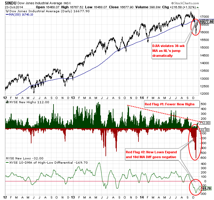
Taking the analysis from above and incorporating it into today’s action, we can see that a market top (if one is beginning), is in its infancy and is likely to have several volatile swings up and down (both in terms of price and the NH-NL readings).

2014_10-30_NHNL_Diff_NYSE_2014-next1

A red flag is just a warning but it becomes a strong signal to take action when multiple warnings are registered. October 2014 is just a warning and I don’t know if it will lead to a more substantial correction but if it does, don’t be surprised to see higher highs before an ultimate breakdown.

If it doesn’t, well, jump back in and ride the trend higher because circumstances are constantly changing when trading the market. No one truly knows what will happen next (and if they do – they’ll be a lot richer than I am when it’s all said and done). The rest of us can only play the odds and manage risk.

My next post will focus on additional market tops so we can get a better feel for history, using charts.

Calling a Market Top

This post will set out to determine if we are currently forming a market top by identifying current warning signals and by using past examples, most notably the 2007-2008 market.

Calling an exact market top or bottom is fairly difficult and not a task that I aim to succeed at. However, I pride myself on gathering warning signs of a major change in trend whether it is a market top or market bottom. Major tops and bottoms don’t happen overnight and typically take months to materialize. And this is good for the longer term investor – it gives us time to make moves and protect capital.

Mr. Market, as some call it, will give the astute investor plenty of warnings as a major change in trend starts to occur, especially at a market top. The market will likely offer head-fakes along the way and this is all well and good provided you maintain your sell stops and follow rules. It can be frustrating to sell prematurely and possibly buy back-in at higher levels than where you previously sold but that is par for the course: simple money and risk management.

Let’s take a look at 2007-2008.

The market was in a prolonged up-trend from 2005 into much of 2007. The DJIA peaked in July 2007 before dropping quickly to end the summer. It briefly violated the 30-week MA but more importantly, the number of New Lows spiked dramatically, to levels not visited in years (this was a red flag). The NH-NL Diff 10d MA and 30d MA both went negative (July 26th and August 1st, respectively). It was the first time the 10d and 30d Diff had been negative since the previous summer but daily readings were much more dramatic this time around, reaching 500-1,132 new lows. The 1,132 New Lows registered on Thursday, August 16, 2007 was more than Black Monday (10/19/87 when 1,068 were logged – fewer issues on index of course). This was just the first red flag but not an immediate sell signal (watch positions closely, maybe raise some cash to be safe).

2014_10-23_NHNL_Diff_NYSE_2007-08

Following the August lows, the DJIA went on to make new highs in October 2007 and then quickly reversed with another batch of New Lows . The second red flag was the fact that New Highs did not exceed previous levels as the DJIA made a new high, a divergence which is telling. Further confirming this second red flag was the fact that the market once again crashed below the 30-wk MA (November 2007). Please note that the initial red flags span from July to November (4 months = “time”).

The third red flag occurred when the market attempted to re-take the 30-week moving average in December 2007 but failed, as New Highs dipped dramatically and New Lows started to creep back up. By January, the NYSE registered another 1,000+ reading (1,114 on Tuesday, January 2, 2008). By this time, the market had dropped more than 2,000 points or more than 15%. Many individual stocks had dropped much more. Sell stops should have been followed and long term investors should have been accumulating cash by this time. Take profits and cut losses when multiple red flags appear (you can always get back in if the correction doesn’t confirm)!

The fourth and final major red flag occurred after the market rallied in the spring of 2008 yet the DJIA could not overtake the 30-wk MA in April and May. Following this failure, the fear and bad news related to the housing and banking crisis were starting to spiral and New Lows confirmed the damage by reaching the greatest levels ever witnessed on the NYSE, culminating with NL’s surpassing 2,000 on two separate occasions, nearly touching 3,000 on Friday, October 10, 2008 at 2,901. The NH-NL diff 10d and 30d MA went negative on Tuesday, June 10, 2008 and Friday, June 20, 2008 respectively. The NH-NL Diff 30d MA did not turn back to positive territory until Wednesday, April 29, 2009 (essentially as a new up-trend was confirming). The market was still trading above 12,000 in June 2008 so any stragglers could have sold, even at a decent loss at this level. If not, that investor rode the market down to the 6,000’s by October 2008, or another 50% loss (remember, it takes a 100% gain to break even after a 50% loss).

Now, before I am called a Monday morning quarterback, visit these blog posts that I made in late 2007 and early 2008, well before the ultimate crash (the Cramer Post lists additional links from 2007):

01/24/2008: Cramer YELLED Buy, I wrote Sell

10/12/2007: Distribution Day

10/20/2007: Second Major Distribution Day

For a detailed look at the monthly New High and New Low data in 2008 and early 2009, please visit this blog post (some excellent and original analysis here):

Identify Market Tops and Bottoms by Doing this, Guaranteed!

Now let’s take a look at 2014!

The first red flag has been materializing over the course of the entire year: fewer New Highs as the DJIA makes all-time new highs: a divergence that’s telling (remember this from 2007).

The second red flag is the increase in recent New Lows, reaching levels not seen since October 2011 (which was the most substantial correction since the bottom in 2009). Furthermore, the NH-NL Diff 10d MA and 30d MA went negative on September 22nd and October 6th respectively. As of this blog post, the NH-NL Diff 30d MA has been negative for 14 consecutive days and will remain negative for at least another week, based on the figures dropping off and being added to the calculation. It will become the longest consecutive stretch since the correction in 2011 (which lasted 71 days). The 2008-2009 negative stretch lasted 215 trading days (June to April).

2014_10-23_NHNL_Diff_NYSE_2012-14_2

The third red flag and it’s early, is the fact that the DJIA has violated the 30 and 40 week moving averages. The market is allowed to do this during normal corrections but it becomes a red flag when the NH-NL diff is negative with increasing New Lows (which is the case in October 2014).

As of this week (October 23, 2014), New Highs are increasing and New Lows are decreasing but that is normal action as buyers and sellers fight to control the trend. This action is similar to October of 2007 (383 New Highs were registered on Thursday, October 11, 2007). Individual days will swing from time to time so it’s most important to step back and focus on the macro trends that are building.

There you have it: several red flags have been logged here in October 2014 so the caution flag has been raised. Just as in 2007, I can’t confirm a new major change in trend will take place but I can tell you to be prepared and watch for additional red flags and respect sell stops. Remember, you can always buy back in if a steeper correction does not confirm. What you cannot do is make up for a large loss if the market starts to free-fall.

As identified in 2007-2008, these changes in trend take time so we can be diligent in making decisions but we cannot lose sight that the market has given us a warning. Until told otherwise, this market is suspect so I am in the business of raising cash levels. I am not completely out of the market but I have tightened stops and raised cash. Cash is a position and I know I can always jump back in with both feet if an up-trend continues. I’m just managing risk!

My Wife’s Personal Mutual Fund Outperforms the Pros

I’ve mentioned this before on the blog and have joked about it several times on twitter but going forward, I’m paying attention, close attention.

To what, you may ask…?

To what my wife is buying and using! As she buys, I will buy, but my purchases will be shares.

Take a look at the following examples since we have been married (we married in 2004):

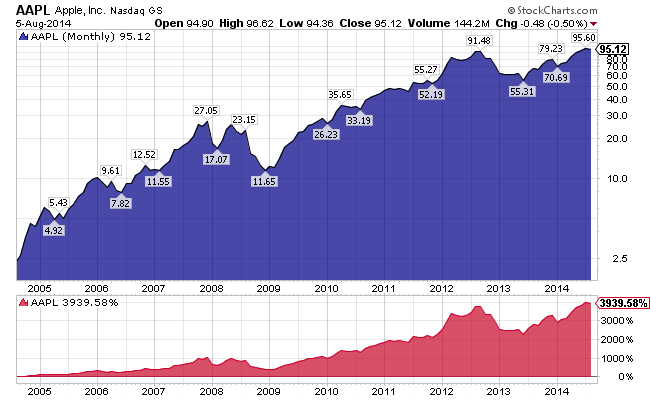
  • Apple $AAPL (iPhone, iMac, iPad, iTunes, apps, etc.)
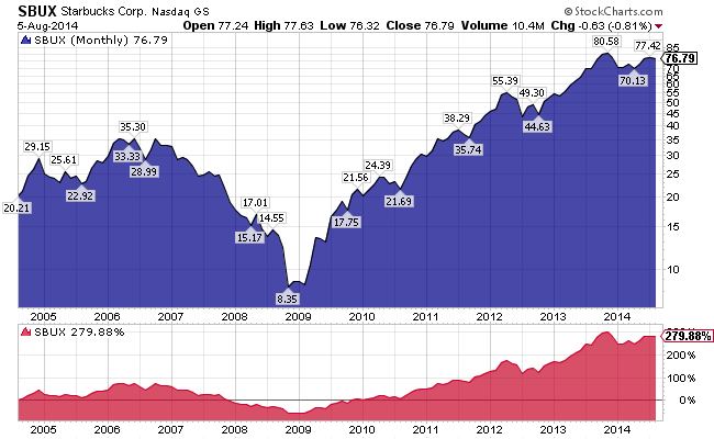
  • Starbucks $SBUX (Caramel macchiato)
  • Google $GOOG (Search: computer & phone)
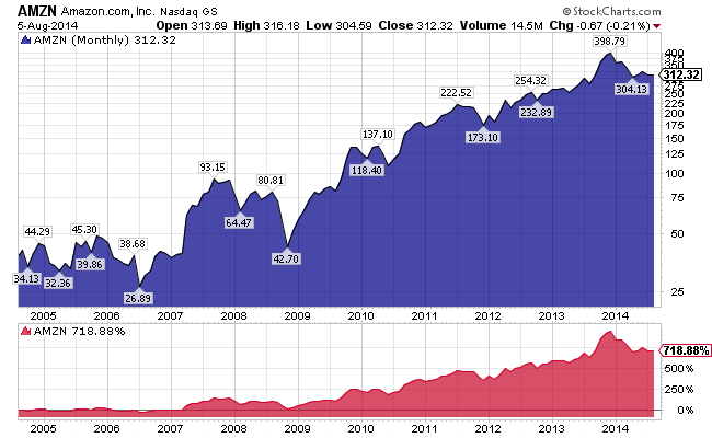
  • Amazon $AMZN (Prime, enough said!)
  • Facebook $FB (Every day)
  • Costco Wholesale $COST (Member since before we were married)
  • Target $TGT (The go-to store)
  • Coach $COH (Several hand bags; even my own business bag)
  • Michael Kors $KORS (Watches & accessories)
  • CVS Caremark $CVS (The go-to pharmacy)
  • Netflix $NFLX (Movies and streaming online series)
  • Walt Disney Co $DIS (Mickey Mouse, need I say more)
  • Johnson & Johnson $JNJ (Kids!)
  • Procter & Gamble $PG (Household)
  • Visa $V (Credit & debit)
  • MasterCard $MA (Credit)
  • Pepsico $PEP (Gatorade, Pepsi, etc.)
  • TJX Companies $TJX (TJ Max, Marshalls, Home Goods, etc.)
  • Home Depot $HD (Projects and equipment)
  • Verizon $VZ (Phone and FiOS)
  • Exxon Mobil $XOM (Gas)
  • Wells Fargo $WF (Banking)

My wife religiously buys or uses products from the companies above on a daily and weekly basis. A simple buy and hold plan, including all of the names above, would have outperformed my gains over the past 10 years. It’s easy in hindsight to make this analysis but I am telling you – I will be watching closely as to what new companies make it on her radar.

2014_08-06_AAPL_10yr

In addition to my wife, I will also be closely watching the names of the companies that my kids get involved with (young at this point but the future is theirs). It’s not a ground-breaking game-plan but appears to be more lucrative than my plan of searching for the next growth industry or 10-bagger. Without her knowing it, my wife’s mutual fund would be comprised of a strategy employed by the great Peter Lynch.

According to sources, Peter Lynch managed the Fidelity Magellan Fund from 1977 to 1990, during which time the fund’s assets grew from $20 million to $14 billion. Even more impressive, Lynch reportedly beat the S&P 500 Index benchmark in 11 of those 13 years, achieving an annual average return of 29%.

Peter Lynch subscribed to the idea of “know what you own”. I know what my wife owns and can take the lesson that many other wives (and people in general) are buying what she is buying. Consumers = profits and profits typically lead to earnings which leads to a rise in share prices. Sounds like a simple formula.

2014_08-06_SBUX_10yr

Don’t get me wrong, I haven’t completely ignored the stocks above as I have owed a few of the names but I haven’t owned them long enough or with enough quantity. Rather than “owning” them, I have been trading them (in short term periods).

In addition to the solid companies above, I am still more attracted to finding the next great growth stock within a great industry. I like to search for cutting edge technology or innovative companies that will lead a new revolution. I research and buy names such as $DDD (3D Systems), $INVN (Invensense), $TWTR (Twitter), $SLCA (US Silica), $TSLA (Tesla) – all of which aren’t on my wife’s “buy list”. She’s aware of Twitter and maybe Tesla but doesn’t use their products or services. Other than me yapping about what I am researching, she would not know the difference between $DDD and $SPLK. Perhaps that’s a message to me…?

Chipotle Mexican Grill, now that she knows, understands and occasionally eats from their establishments.

I am sure a few of the companies she uses haven’t performed all that great but the vast majority have been excellent.

So, forget my mutual fund and forget the pros and their fees. I should create my wife’s mutual fund and ride those profits into the retirement sunset!

10-Year Charts of My Wife’s Mutual Fund:

2014_08-06_GOOG_10yr

2014_08-06_AMZN_10yr

[Read more…]

Market Breadth: NH-NL Update

A long time favorite blogger of mine, Brett Steenbarger, Ph.D. (welcome back), of the blog Traderfeed wrote a post this weekend that inspired me to post my latest breadth figures.

He stated, in the post: Useful Trading Tools – Part Four: Stock Market Breadth:

“You can see that new highs vs. lows have been waning in the last few days, but also since late December. I am watching this closely, as it suggests that we may be toward the top of a rangebound consolidation period in stocks at the very least–especially given the expansion of new lows during the most recent market drop.”

The Dr. notes that the NH-NL differential has been “waning” and that the breadth indicator may be reaching the top of a rangebound consolidation period for stocks. I don’t disagree but my findings are as such, based on the charts and data below.

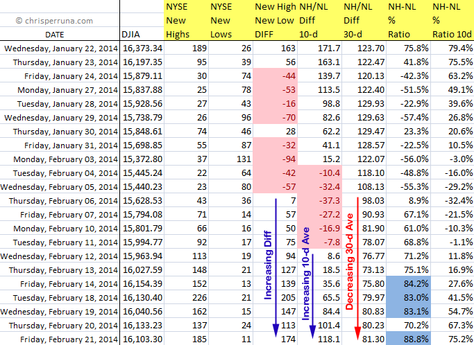
Starting with the raw data, we can see that the short term differential and 10-ma Diff are both increasing over the past couple of weeks. Now, they aren’t increasing with great strength but they are moving higher after a short lived “negative period” (highlighted by the pink cells for the Diff and 10-d ma). The longer term 30-d average never went negative during this period. In fact, the 30-d Diff average hasn’t been negative since September 19, 2013 which continues to tell me that the attempted corrections have not gained sustainable traction. Even back in September, the negative readings were short lived. We haven’t had a TRUE sustainable correction, based on this NH-NL breadth indicator, since 2011.

2014_02-23_NHNL_Data

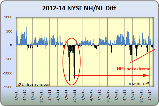
Looking at the basic New High – New Low daily differential chart, we can visually see that NL’s are nowhere near extreme levels and have been weakening since the 2013 peak set back in late June. Additionally, NH’s have also been weakening since their peak in May 2013. To the Dr.’s point, the breadth is also consolidating (similar to a triangle). But, there hasn’t been a major move to either end of the spectrum, positive or negative (the indicator has remained mostly neutral).

2014_02-23_NHNL_Diff

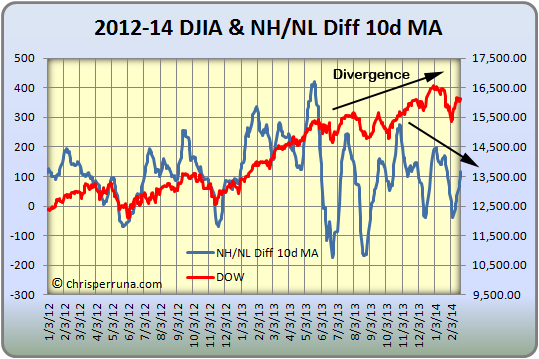
The next chart looks at the NH-NL Diff 10-d MA overlaid on a chart with the DJIA. The power of this chart shows the divergence of the DJIA making higher highs while the number of stocks making new highs vs. new lows decreasing. This resembles the chart the Dr. used in his blog post. Here’s where we can note a minor red flag.

2014_02-23_NHNL_Diff_10MA-Dow

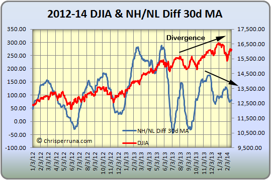
Similar to the chart above, the next chart shows the NH-NL Diff 30-d MA overlaid on a chart with the DJIA. The divergence is even more apparent with this chart and definitely raises a red flag for caution while aggressively trading going forward. It doesn’t mean to stop trading or investing as the NH-NL is still positive and the breadth indicator has yet to show a sustainable breakdown in nearly three years.

2014_02-23_NHNL_Diff_30MA-Dow

Until multiple warning signs appear and the NH-NL goes negative for a sustained period of time (bringing with it the 10-d and 30-d Diffs), feel free to ride the trend by investing and/ or trading in the leading candidates.