A long time favorite blogger of mine, Brett Steenbarger, Ph.D. (welcome back), of the blog Traderfeed wrote a post this weekend that inspired me to post my latest breadth figures.
He stated, in the post: Useful Trading Tools – Part Four: Stock Market Breadth:
“You can see that new highs vs. lows have been waning in the last few days, but also since late December. I am watching this closely, as it suggests that we may be toward the top of a rangebound consolidation period in stocks at the very least–especially given the expansion of new lows during the most recent market drop.”
The Dr. notes that the NH-NL differential has been “waning” and that the breadth indicator may be reaching the top of a rangebound consolidation period for stocks. I don’t disagree but my findings are as such, based on the charts and data below.
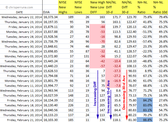
Starting with the raw data, we can see that the short term differential and 10-ma Diff are both increasing over the past couple of weeks. Now, they aren’t increasing with great strength but they are moving higher after a short lived “negative period” (highlighted by the pink cells for the Diff and 10-d ma). The longer term 30-d average never went negative during this period. In fact, the 30-d Diff average hasn’t been negative since September 19, 2013 which continues to tell me that the attempted corrections have not gained sustainable traction. Even back in September, the negative readings were short lived. We haven’t had a TRUE sustainable correction, based on this NH-NL breadth indicator, since 2011.
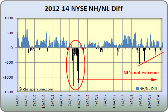
Looking at the basic New High – New Low daily differential chart, we can visually see that NL’s are nowhere near extreme levels and have been weakening since the 2013 peak set back in late June. Additionally, NH’s have also been weakening since their peak in May 2013. To the Dr.’s point, the breadth is also consolidating (similar to a triangle). But, there hasn’t been a major move to either end of the spectrum, positive or negative (the indicator has remained mostly neutral).
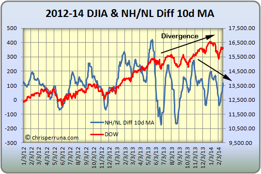
The next chart looks at the NH-NL Diff 10-d MA overlaid on a chart with the DJIA. The power of this chart shows the divergence of the DJIA making higher highs while the number of stocks making new highs vs. new lows decreasing. This resembles the chart the Dr. used in his blog post. Here’s where we can note a minor red flag.
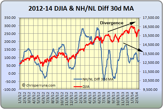
Similar to the chart above, the next chart shows the NH-NL Diff 30-d MA overlaid on a chart with the DJIA. The divergence is even more apparent with this chart and definitely raises a red flag for caution while aggressively trading going forward. It doesn’t mean to stop trading or investing as the NH-NL is still positive and the breadth indicator has yet to show a sustainable breakdown in nearly three years.
Until multiple warning signs appear and the NH-NL goes negative for a sustained period of time (bringing with it the 10-d and 30-d Diffs), feel free to ride the trend by investing and/ or trading in the leading candidates.



Connect with Me