Market tops take time to form, just look back at history and review the progressions of the previous setups.
When reviewing the 2007-2008 market top, it’s clear to see that the setup took six full months. Even then, the market bounced around for another four months but it was clear that the trend had changed, as the 200 day moving average had already started to trend downward and switched to resistance rather than the previous support it provided.
Looking at the DJIA, we can identify six progressions over the course of six months
- The index made a new high in July 2007
- It challenged the 200d ma in August, only to capture support
- Another new high was made (above the July high) in October 2007
- By November, the index broke below the 200d ma – NOTE: the 200d ma was still trending higher at this time
- The DOW then recovered the 200d ma but failed to recover new highs, a red flag in December
- By the end of the month, the DOW broke back below the 200d ma on above average volume, a clear sign that this market was headed for a correction
- The market made a final attempt to recover the 200d ma in April and May of 2008 but failed again, but much lower than the summer highs of 2007. If one hadn’t sold yet, this was another clear red flag to protect profits and move to the sideline (the market dropped another 50% from here).
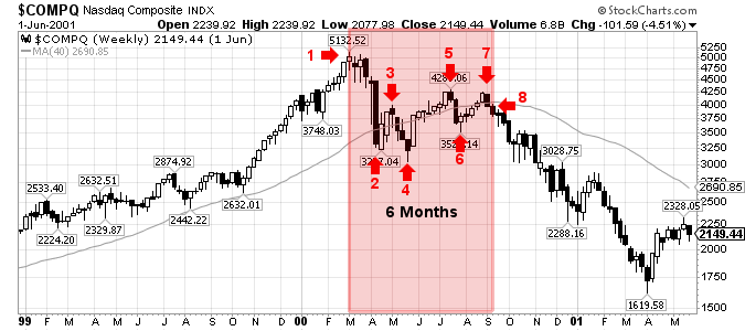
A similar setup and duration took place with the Nasdaq market top in 2000.
Looking at the COMPQ, we can identify eight progressions over the course of six months
- The index made a new high in March 2000
- It challenged the 200d ma in early April, capturing temporary support
- The index tried to recover the 200d ma throughout April but that was short lived
- By May, the index broke back below the 200d ma – NOTE: the 200d ma was still trending higher at this time
- Tow months later, in July 2000, the COMPQ was working its way high, above the up-trending 200d ma but was still 17% off of it’s all-time highs, a lack of strength (market churn).
- By late July, the index closed below the 200d ma
- The COMPQ recovered the 200d ma for the third time in August but once again failed to trade above the previous high in July and nearly 20% below the all-time high set back in March.
- Lastly, the COMPQ dropped back below the 200d ma in September 2000, as the long term moving average started to trend downward, the first time in years.
By studying the major corrections of the past, a patient investor should be equipped to analyze the necessary and relevant data, recognize if a correction is normal or spot the technical red flags that will confirm a change in trend (i.e.: major correction).
A long-term investor must accept that they will NOT get out at the top but remain confident that they can avoid the bulk of the downturn. By studying the 2000 and 2007 markets, a long-term investor should be able to sell within 20% of the market top and well before the ensuing additional drop (which was greater than 50% in 2000 and 2008).
NOTE: The New High – New Low Ratio is another key indicator that substantiates the move, one way or another, but I will leave that specific analysis for another post. As it stands today, the NH-NL 10-d Diff is still positive.
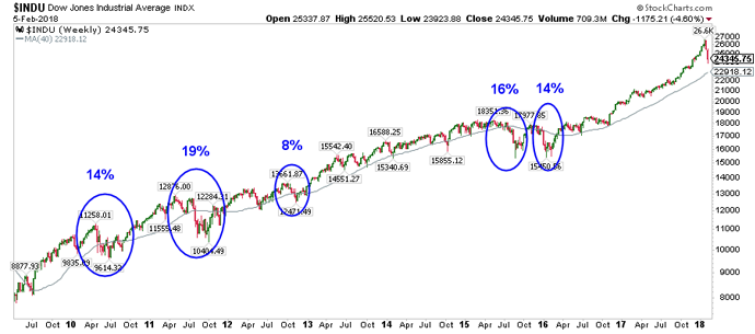
As for the 2018 market, if anyone wanted a lesson in market psychology, it was on real time display as the calendar turned to February. The main stream media and scores of people on fintwit stared to freak out as the market started to sell off with 1,000 pt drops (less than 5% drops).
I posted this chart to Twitter & Stocktwits on February 5, 2018, which highlighted the previous drawdowns for the DJIA over the prior two years. I posted it to show that the 200d ma was still trending higher and that investors should welcome a normal correction, in-line with the previous 8%-19% drawdowns.
Further, the percentage of stocks trading above the 50-d ma started to drop rapidly, signaling a short term oversold signal, as this chart showed, posted on February 11, 2018.
I’m not ready to call a market top or change in long term trend but I am watching. What I have learned is that a market top or change in trend will likely take some time with several back-and-forth struggles between buyers and sellers.
Until the market confirms (continuation of the up-trend or a change in trend), hold tight with the stocks in your portfolio that are performing well. Specifically, hold the stocks that are trading near new highs and/or have strong relative strength ratings.
As for the stocks that start to fail, below their respective 200-d ma’s, considering selling a portion or all of that position.
The last chart shows possible progressions, not that it will follow the exact points that I have created here but look for something similar and WATCH the 200d ma.
Let’s see what this market wants to do.
$DJIA $COMPQ $SPX


Thanks Chris this is exactly what I was trying to explain to someone about how tops are formed.
Dont know if you saw this article
Stock Market In a Rogue Wave
http://www.mcoscillator.com/learning_center/weekly_chart/stock_market_in_a_rogue_wave/
Dear Chris:
Are you implying that 40D MA acts as a good indicator? When price moves above that line it is in a positive trend and when it breaks below, trend seems to be down. And price constantly use it as a bounce point until it breaks thru to change directional trend.
You constantly talk about 200D MA and not 40D MA.
Please clarify.. thanks.
DINAKAR