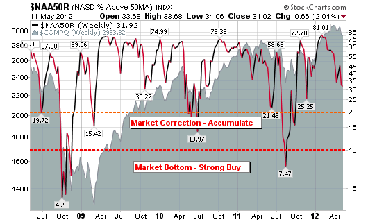
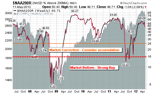
This post contains three simple charts that will give all investors a fantastic risk vs. reward setup/ signal. By following these simple charts, any investor should be able to consistently outperform the market (buy when the market is deeply depressed and sell when it becomes over-bought). Please keep in mind that these signals are for longer term investors as they only appear once every year or so.
The three charts represent the % of stocks above the 50-day moving average for the NASDAQ, the % of stocks above the 200-day moving average for the NASDAQ and the % of stocks above the 50-day moving average for the S&P 500.
The recent sell-off has been steep (points only) but unfortunately, we haven’t come close to historic bottom signals. This simple fact (using the charts below) suggests that the market has further room to consolidate so be careful with your buy and sell decisions.


Great charts Chris, thanks.
Hello Chris
Nice charts
can you explain on how you established the 20 (market correction-accumulate) and 10 (market bottom-strong buy) line in the first charts?
Thank You
Ron
Thanks Chris. Looks like the charts are from stockcharts.com, if I’m not mistaken? Did you have to build them yourself? Or can they be found under thee free groupings they provide?
Thanks for this great example. we’ve built our Heat Map app for iOS around these averages as they are very powerful and lead to a lot of successful investor techniques.
Ron, the lines are based on historical study of market bottoms and corrections. My own interpretation.
Mike, I built the charts myself with annotations and comparisons.
Hi Chris, Good points… I don’t think the timing is right yet. I think theres a good chance of more movement to the downside with all the greece issues going on right now. I think there may be some better entry points in the coming weeks.
I could see this working well since 2008 with all the extreme oversold/overbought conditions that seem to happen every year. What about a strong uptrending market like in the 80s and 90s? Would you sell in overbought territory and never be able to buy back in? Just curious.
Aaron, the indicator is structured to give an accurate signal more so on the oversold side rather than overbought. Overbought levels can be maintained for months. Extreme Oversold levels are historically accurate nearly every time.
Thanks for the response! I noticed this past week that the Nasdaq and SPX 50MA’s dipped into oversold territory, but not the Nasdaq 200MA chart. Do you wait for all three to confirm? I bought near the bottom this week but ended up getting out with a scratch in the chop action (fearful of another leg lower…). In hindsight, had I stayed in the trade based on the signals in the above charts, I’d still be showing a profit.