There are always several ingredients that can tell the story of a possible market bottom or tools that allow us to spot a new up-trend even if it is only a bear market bounce (a sustainable bounce). As you know, I have been monitoring the NH-NL differential very carefully over the past few months as it has turned positive for the first time in well over a year. It remains weak and has not screamed buy but it is still etching higher, ever so slowly. The charts in the post titled NH-NL Picks Market Tops and Bottoms show clearly how weak the differential has been since 2007.
A secondary indicator, the cumulative advance decline line, is one I have been studying since late last year. I didn’t use this tool in past markets because I wasn’t too familiar until I picked up a book by Justin Mamis, The Nature of Risk (which I highly recommend – quickly becoming one of my personal all-time favorites).
Several ingredients that can signal a bottom include:
- The initial market breakdown: 2008
- Bear market bounces: late 2008 and early 2009
- An investor “give-up” phase: Increasing market pain that seems to never end and will get worse
- When bad news fails to carry stocks even lower
- When new lows dry up and new highs creep up
In addition to the items above, some secondary indicators can work alongside price action, volume and the NH-NL Differential. This is where the Cumulative A-D line and divergences can help confirm the main indicators.
The lesson is that indicators exist in a real, everchanging world. They are not so definable that you can put them in a computer, with parameters that ring bells, because a human being still has to interpret their subtleties. But a few indicators do still work, the most important of which can be described as the divergence pair. – Justin Mamis
As Mamis notes, they work because they are statistical summations of what the individual stocks are actually doing. Essentially, this is exactly what price and volume tells us (real time information of what the market is doing). Lastly, the NH-NL ratio packages that information and lets us get a true reading for a possible trend (the NH-NL does lag price and volume slightly).


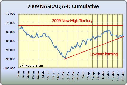
Looking at the 2009 NASDAQ Cum A-D Line, we can see that an up-trend is forming but it is not in new high territory yet. However, the NYSE line is in new high territory, which Brian Shannon of alphatrends pointed out last week in this chart.
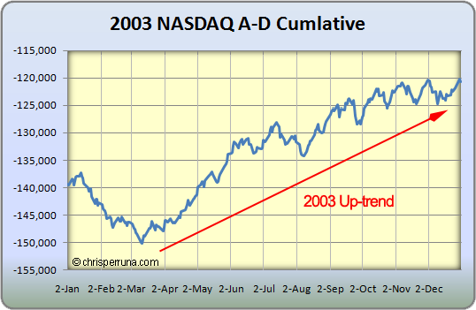
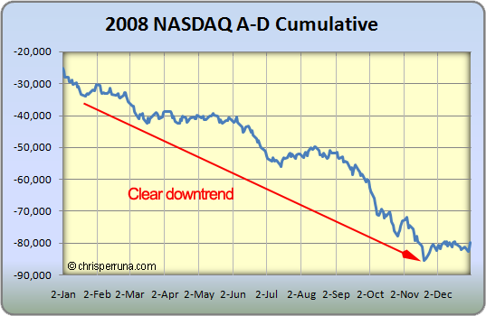
The point of this post is to show you the similarities of the 2002 and 2008 markets versus 2003 and 2009 markets. It’s very interesting to see that the 2003 market had a bottom in Cum A-D line in March and made a new yearly high in late May. Well, this year’s Cum A-D line made the low in March and is trying to make a new high here in early June, very similar.
The same findings were true when I posted up the charts for the differential last month. Only time will tell what’s going on but things are slowly changing from 2008. Let’s keep watching and get ready to pounce if and when the ultimate buy signal appears.


If you liked Justin Mamis’ “The Nature of Risk” you should read his “When to Sell”. That one is possibly my all-time favorite. I think it can easily form the foundation for one’s whole investment lifetime.
Eric,
I agree, When to Sell is an excellent book – I did a write-up back in late 2007: http://www.chrisperruna.com/2007/12/11/when-to-sell/
Chris,
I remember you used to use investor business daily’s new high new low numbers to calculate the ratio by performing this calculation:
(New Highs – New Lows) / (New Highs New Lows) * 100 = X%
to get the ratio number.. and you would have a zone where you feel it’s more bullish, where it’s more neutral, and an area where it’s more bearish.
however, now through your new posts on nh-nl. the method as well as the charts seems to only show you using the differential of the nh against eh new low… without the ratio coming into play.
is there a reason why you decided to simply use the differential now instead of the old ratio method?
also is there a reason why you decided to use the data from pinnacle data and not ibd anymore?
I value this a lot so was just wondering what made you deviate from the original method?
Michael,
I do keep the stats for the % ratio calculation for the NH-NL ratio (I do it on a daily basis now based on the pinnacle data). Only 3 days in 2009 have crossed above 80% and they have all happened since April 17, 2009 (I should post an updated chart).
I prefer the 10-d Diff now because it gives me a smooth trend reading. The % method still works but is more volatile.
I now use the pinnacle data because it is accurate and I know exactly where it comes from and when I can access it. The IBD data was inconsistent with the market data from sites like NYSE and Nasdaq. Bottom line, use the same data from the same source and you should be fine. The pinnacle data went back to 1978 for the NASDAQ and 1965 for the NYSE.
Chris,
when i was using the ibd new high and new low i would get the new high and new low by combining the numbers from nye, nasdaq as well as ASE (ibd has 3 exchanges listed for their new high and new low)
i believe this is what you used to do as well right?
i’m interested in giving pinnacle data a go and see how i like it. do you only use the new high new low from nyse and nasdaq or do are you signed up for the ASE composite group as well?
You say that you prefer the 10-d diff method now, but that chart is plotted with decisionpoint.com i’m assuming that chart uses the data from that web site and not your data from pinnacle?
sorry for all these questions lol Just trying to figure out the best way to do do this so i wont have to subscribe to everything, eIBD, pinnacle data, as well as decisionpoint.com
Anyway, if you could make a new post on the blog about the new method of tracking new high new lows, as well as the services you use to either get the data or chart the mined data, as well as an udpate on things that would be wonderful ! 🙂
Hi Chris,
Didn’t find your mail on your site. I was wondering if i could do a small interview with you (skype). I follow your blog for a long time and i really like the way you are trading. Together with some friends we also started a (free) website (but in dutch). We were wondering if you would like to answer some questions about your trading style, etc.
Please let me know (i know you’re a busy man, especially now with the baby ;))
Greetz
Michel
This advance decline line looks very interesting. I have been looking for another method to determine overbought and undersold prices. Is this available for download anywhere? Thank you.
Hi Chris,
Right now I am reading some of you’re posts with a lot of interest. I heard from your blog trough the website of Monest (I am a convinced member of their educational approach). For the moment I am also reading the book ‘When to Sell’ from Justin Mamis. And I am trying to calculate his H-L differential indicator and Advance/Decline line. The first one worked out fine, the second one stays foggy for me.
I would like to ask you how you calculate the Advance/Decline line…
Justin Mamis wrote in his book: “This line is a simple running total of the net difference each day between advances and declines”At pg. 117 he shows two graphs of the advance/decline line march-april-may 1971 and 1972 with values of -10 and -25 for those 3 months. When I calculate I have values in between -1241 and 573 (Adv values – Decl values, disregarding previous values) or in between -346 and 273 (adding a moving average of 10 for the adv and decl values and then dividing by 10) for those periods.
Best regards,
Amedee