Point and figure charts are one of the great tools many technical traders overlook. I have followed them since I was 15 years old due to my father’s love for the technique. He would plot hundreds of charts each year by hand in a graph book prior to computers in the 1970’s and 1980’s. He taught me about the charts and the key support and resistance areas to look for when scanning for opportunities. I found this old case study I did in 2005 and thought it would serve as a perfect example of the power of point and figure charts.
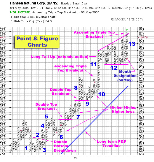
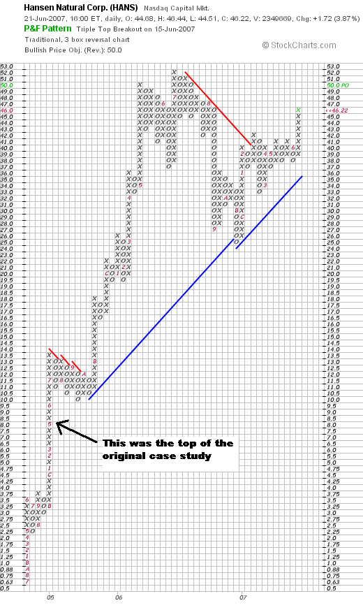
The chart was sounding a buy on 5/4/05 even though the stock had already moved from $20 to $60. Would you have bough? I did as did many MSW members that e-mailed me. See the updated chart below to see what HANS went on to accomplish.
For today’s exercise, please understand that I didn’t highlight every single breakout on the P&F as that would have cluttered the Hansen Natural (HANS) chart. However, I did highlight the obvious, stronger breakouts that were confirming this stock’s strength time and time again. No one should have missed HANS in 2004 and 2005 if you were trading this chart along with basic price and volume.
Follow along with the legend below and start to learn about the world of point and figure charts. I bet you won’t stop using them once you learn the benefits and accuracy that they can add to your more traditional technical analysis tools.

Please note that this chart was originally featured as a case study for MSW back in May 2005 when HANS was trading at $64.09 (pre-splits).
Legend:
- (1) This snapshot starts with a new double bottom breakdown as the stock finds support in the $18 area.
- (2) We can see the small double top breakout that takes place shortly after the previous breakdown (where support was established). A simple glance will tell you that HANS has not visited the $18 area since this first breakout.
- (3) The next row of O(s) takes the stock down to $18.50, a higher low than the previous (a sign of some strength and a possible start to a new trend).
- (4) The stock quickly moves to $25 with a long row of X(s) (8 to be exact). We are still below the previous high of $29 earlier in June. Quickly thereafter, the stock starts to move down, making a high low of $19.50. This is the second sign that HANS is starting to form a new up-trend.
- (5) By September 2004, a new double top breakout takes place with a new high reaching the previous $29 high set in June. (The numbers in the boxes represent the months of the year to give you some perspective of time).
- (6) At this point we consolidated and form support near $23, marking the beginning of a long string of higher highs and higher lows (a sure sign of strength).
- (7) During this string of higher highs, we count multiple double top breakouts and/or an ascending triple top breakout which brings the stock to $38.
- (8) When the final double top breakout occurs, HANS moves into an extended period also called a “long tail up”. This long tail reached $47 by the time January and February roll around.
- (9) A quick profit taking period occurs with support coming in at the previous breakout area of $38. (Support and resistance working perfectly).
- (10) After confirming the $38 support area, HANS starts another string of higher highs and higher lows in late February and early March.
- (11) A second long tail up forms as we are now reaching an extended area of $58.
- (12) A new consolidation as some profit taking occurs with a row of O(s) taking us down to $53. The stock uses this support are 3 separate times, confirming strong support at $53.
- (13) More recently, HANS has been making new highs with support at the 50-d moving average (can be seen on a more traditional chart) but the lows have been stagnant (we are not seeing higher lows with the higher highs).
You can learn more about P&F charts through this post, one that I did on my former blogger blog (hopefully the images still show): What is a Point and Figure Chart?
6/26/2011: NOTE: This link no longer exists, try this instead: Point & Figure Charts
I go into great detail about the types of patterns and setups I follow with P&F charts in the post above.
Finally, I asked one question at the end of the original case study in 2005:
“Is this the end of the phenomenal run for Hansen Natural Corp.?”
Well, the answer is in the chart below as it was just the beginning!


Chris,
You must have read my mind. Believe it or not, I never heard of these charts until I began reading your blog and could never really understand them. I had been meaning to drop you a line to ask you how to read these charts and you put this post up. Thanks for the lesson!
BTW…SPWR as of 945am trading almost 4% higher at $63 on decisively strong volume. If it holds up during the day, it will break through the $62.50 resistance.
Albert,
Read the first post I made back in October 2006 to get a better feel for the P&F charts. Buy the recommended book if you really enjoy this style of analysis. They are great but understand that they don’t replace simple price and volume candlestick charts.
Chris,
I am a rookie investor just starting to learn about investing. I’ve never experienced a harsh bear market nor a huge sell-off (besides the one back in Feb.)
My question to you is – is it still acceptable to grab shares of top-rated stocks during a bear market?
How do you trade during a bear market. Do you keep trading? According to Oneil’s book, our style of investing won’t work as good during a bear market.
P.S. Thanks for information you provide on this blog.
Jason,
You can still buy during a bear market but yuor odds of success decrease. It also depends what sector or industry your buying is coming from. I trade less during a bear market as I am a CANSLIM trend trader. However, I do buy puts and short occassionally. As long as I can find a trend (up or down doesn’t matter to me).
Thnx for the info!
What is the best book for learning “point and figure ” charts?
Thank you for the good work and greetings from Belgium
Reneke,
One of the best places to visit to start learning about P&F charts is through this link at StockCharts.com:
http://stockcharts.com/help/doku.php?id=support:understanding_pnf_charts
I also recommend the book:
Point and Figure Charting: The Essential Application for Forecasting and Tracking Market Prices, 2nd Edition by Thomas J. Dorsey
It was expensive in the past but the price has come down on Amazon to $37.77 but I would recommend buying it used for $19.99 or visit your local book store. The book is not on my recommendations page due to its former price of $59.95 which I felt was not worth my value. However, at $20, I highly recommend the book to anyone interested in learning about P&F charts.
Hello,
there are some nice online resources about point and figure available. Most traders don,t know point and figure charts because they don,t understand them well. If you don,t understand them you miss out a huge opportunity to see undistorted supply and demand in action. Have a look at http://www.pointandfigure.net .
Sorry, this article is nonsense because learn first correctly point and figure price target calculation. If you apply these rules to trade that way with point and figure charts you are going to pay a lot of money for learning.