Standard & Poor’s said it downgraded the U.S. government’s credit rating from AAA to AA+ because it believes the U.S. will keep having problems getting its finances under control and pointed to the lack of leadership in Washington. Per Yahoo Finance: “The Obama administration called the move a hasty decision based on wrong calculations about the federal budget. It had tried to head off the downgrade before it was announced late Friday.”
Politicians lie and markets do not so ignore Washington and focus on PRICE and VOLUME action!
So, with that said, what does last week’s action across the US and global market truly mean? The $DJIA was down 5.75% on the largest volume since last summer, the $COMPQ was down 8.13% on the largest volume since May 2010 and the $SPX was down 7.19% on the largest volume since May 2010.
All three major markets confirmed a Dow Theory Reversal, a “Change of Trend”. In addition to the major indexes, the Dow Transports TRAN also confirmed a Dow Theory Reversal by breaking support and making a lower low.
Emotionally, I suspect that the market will bounce and that many stocks and indexes are “oversold” but this will most likely only be short term. Long term, the trend HAS CHANGED according to the charts. And until the charts show a new trend to the upside, all moves up are suspect. No one has to pick the exact bottom or top of a market so be grateful to recognize a trend and grab 60-80% of the move. It’s a lot safer and less risky to jump on board once the trend is confirmed rather than play a guessing game that can get you caught in a 500 point slide, similar to last Thursday. Markets can change on a dime so be prepared at all times but longer term trends stay intact for months, if not years.
I made a mistake in my general market analysis by not paying enough attention to my New High – New Low (NH/NL) Indicator. And it cost me because I put on positions in $RENN and $DANG in recent weeks after warning signals had been given. I did avoid a new position in $LNKD and saved money heading into the earnings announcement. Overall, shame on me but I didn’t lose too much because rules were followed and I am digging deep to listen to my indicators. Regardless of what “ I think may happen”, I am listening to my indicators and charts 100%!
So you ask: What warning signals?
The first signal was given by the Dow Jones NH/NL 10-day average differential (Diff) (chart above). The 10-d Diff started to make lower lows as the Dow was making higher highs, a clear divergence that warns the underlying stocks are weakening while the overall market is making a new high. This one signal alone should have put me on caution while entering new positions. It didn’t because the NH/NL 10-d Diff was still above the critical level of zero. Well, the market took care of that this week by plunging below the zero level, closing at -203 on Friday for the Dow. Consider this, it closed at +15.1 last Thursday ( 7/28) but went red the following day at -2.5 (last Friday, July 29, 2011). The divergence and the reading below zero was now screaming MOVE TO CASH and gave us enough time to do it before the end of the week romp! We all had time to get out without taking a loss. As it stands now, the 30-d Diff is also below zero with a reading of -21.47, the first reading below zero since July of 2010.
It’s interesting that the markets topped in May, just as Osama Bin Laden was killed – I must give a HT to Howard Lindzon for coining the Osama Bin Laden Top (he may have nailed it) and closing his blog post with this statement:
With the mood of financial markets quickly turning negative, the horrific price action of financials, the silliness of IPO valuations and some Bitcoin mishigas, you may not soon forget the ‘Osama’ top.
Now, let’s take a look at a number of charts and see what they “were” saying and what they “are” saying right now, as we head into next week (ahead of the market reaction to the US credit downgrade). NOTE: I personally believe that the downgrade is mostly priced into the market but I am sure we will still see some further selling pressure before a normal bounce.
The first chart that I would like to explore is the percentage of stocks trading above the 50-day moving average on the S&P 500 Index. Oversold conditions typically appear when this indicator drops below 20%. We last saw multiple readings under this level back in May, June and July of 2010, the last time the market traded below the 200-d ma. The reading closed at 3.6% on Friday, the lowest level since the 2008 market correction. This says that the market is oversold and is due for a bounce which may be the case but keep in mind that readings below 20% can exist for months at a time with short term rebounds. So, I see this signal as short term for now, considering the Dow Theory confirmations and the NH/NL readings. We will bounce higher but the other charts are signaling a longer term correction until told otherwise!
This chart shows the NH’s and NL’s added together to give us the daily differential. Friday registered the most new lows since November 21, 2008 when the reading spiked to 1,527 (historically low territory). The NH/NL ratio is best used to tell us when the market is changing trends rather than picking the tops and bottoms of markets. The NH/NL ratio has been mostly positive since March of 2009 so the readings of the past few days are red flags as the strength among the individual market participants is weakening considerably.
The NH/NL 10-d Diff is the average of the daily calculations over the past ten days. This 10-day average allows us to view the market action with less volatility than the daily fluctuations. The chart clearly shows us that the NH’s have weakened considerably since 2010 but did make a new high in February of this year. However, that new high was short lived and never quite made it to the peaks of 2010. The red arrow shows us that the NH’s have been trending downward for the past 18 months but most importantly, the peaks have been coming up short from March, to May to July.
NASDAQ CHARTS:
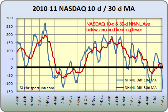
Similar to the Dow Jones NH/NL chart, this NH/NL chart of the Nasdaq is also racking up new low statistics, the most since March of 2009, the beginning of the bull market. What does this tell me: it tells me that the market may be turning since the readings now mimic the start of the up-trend. Short term, we’ll bounce around but watch the NH/NL 10 & 30-d Diff charts to avoid the daily noise.
The next three charts reinforce the action that we are seeing on the Dow Jones. Trend changes can be taken more seriously when two or more of the major indexes confirm the same action on the charts. We have all major indexes flashing the same signals: NH’s weakening, NL’s increasing, Dow Theory Reversal confirmation and distributions days and weeks on big time volume.
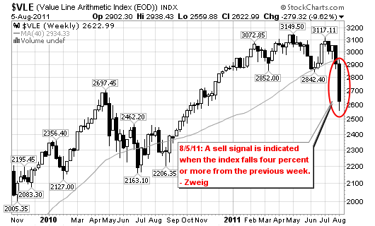
One last signal to watch is the action on the Value Line Index (VLE) which was featured in the post What Should We Do, written on October 27, 2008 when the market was hitting new lows. This indicator was down 9.62% last week, a clear sell signal.
The Four Percent Model Indicator uses the Value Line Composite Index (I use the Value Line Arithmetic Index (EOD) or symbol $VLE on StockCharts.com), which can be found on the web or in financial pages of newspapers. The model makes use of the weekly close of the Value Line Index. A buy signal is generated when the index rises four percent or more from the previous week. Similarly, a sell signal is indicated when the index falls four percent or more from the previous week.
I leave you with this: If the trend (this article and analysis applies to the longer term trend, not for day and swing traders) has truly changed for good and does not have the stamina to reverse back to the upside, be careful but understand that this is only the beginning. You still have time to get out before further damage to your accounts. We will have a bounce or two so use them wisely but don’t stay or go long if the Dow Theory doesn’t reverse the trend back to the upside. You have been warned, not by me but by the price and volume action of the market!


Well said, great post.
Chris,
As always, thank you for your insights!!! Your observations and opinions are much appreciated. I have a question on the 2010-2011 NASDAQ & NH/NL Diff 10d MA chart. I understand how you calculate the 10d NH/NL line. How do you plot the NASDAQ average on the same chart for comparison and to find any divergences?
Thank you.
Chris,
Tremendous insight on US markets. I live in India and follow your blog regularly. In India there is downtrend since Nov. 10. Can you tell about 4 year cycle in US?
Thanks.
Yes! Yes! Yes! Right on. This is exzactly what is going on in the markets. One must realise their gain and minimise there loss.